Quickly visualise stacked proportions (e.g. cell-type composition over conditions) as an alluvial plot.
Usage
plot_alluvial(
  df,
  x_col = "Group",
  weight_col = "Percentage",
  stratum_col = "Cluster",
  width = 0.3,
  border_size = 0.5,
  x_angle = 0,
  palette = NULL
)
Arguments
- df
A long-format data frame.
- x_col
Column mapped to the x-axis, default
"Group".- weight_col
Numeric column summed within each x-stratum, default
"Percentage".- stratum_col
Column defining each stacked segment, default
"Cluster".- width
Numeric; width of each stratum (default 0.3).
- border_size
Line width for stratum borders. Default
0.5.- x_angle
Rotation angle for x-axis labels. Default
0. Accepts0,45, or90.- palette
Optional colour vector; unnamed = applied by order, named = matched by
stratum_col.
Examples
library(dplyr)
#>
#> Attaching package: ‘dplyr’
#> The following objects are masked from ‘package:stats’:
#>
#> filter, lag
#> The following objects are masked from ‘package:base’:
#>
#> intersect, setdiff, setequal, union
example_data <- tibble(
Group = rep(c("Ctrl","10","20","30"), each = 7),
Cluster = rep(c("Il1b+","Cxcl9+","Spp1+","Folr2+",
"Clps+","Mki67+","Marco+"), times = 4),
Percentage = c(
5,10,15,20,20,20,10,
25,20,15,15,10,10, 5,
30,20,15,10,10,10, 5,
35,25,15,10, 5, 5, 5)
)
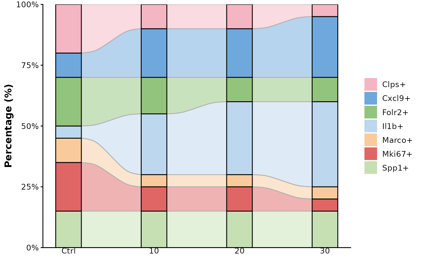
# default palette
plot_alluvial(example_data)
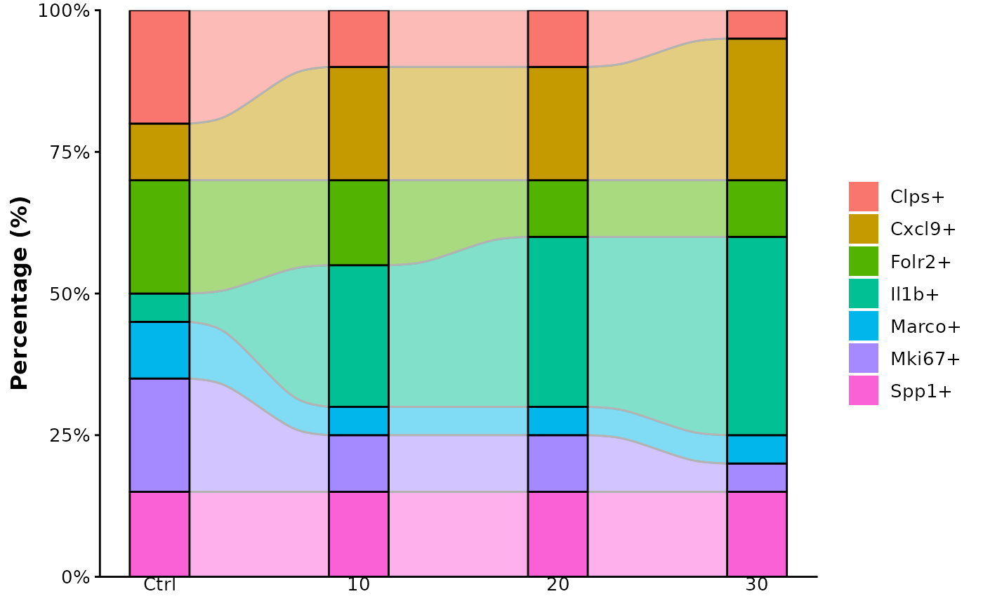 # custom palette (unnamed vector)
my_cols <- c("#A6CEE3","#1F78B4","#B2DF8A","#33A02C",
"#FB9A99","#E31A1C","#FDBF6F")
plot_alluvial(example_data, palette = my_cols)
# custom palette (unnamed vector)
my_cols <- c("#A6CEE3","#1F78B4","#B2DF8A","#33A02C",
"#FB9A99","#E31A1C","#FDBF6F")
plot_alluvial(example_data, palette = my_cols)
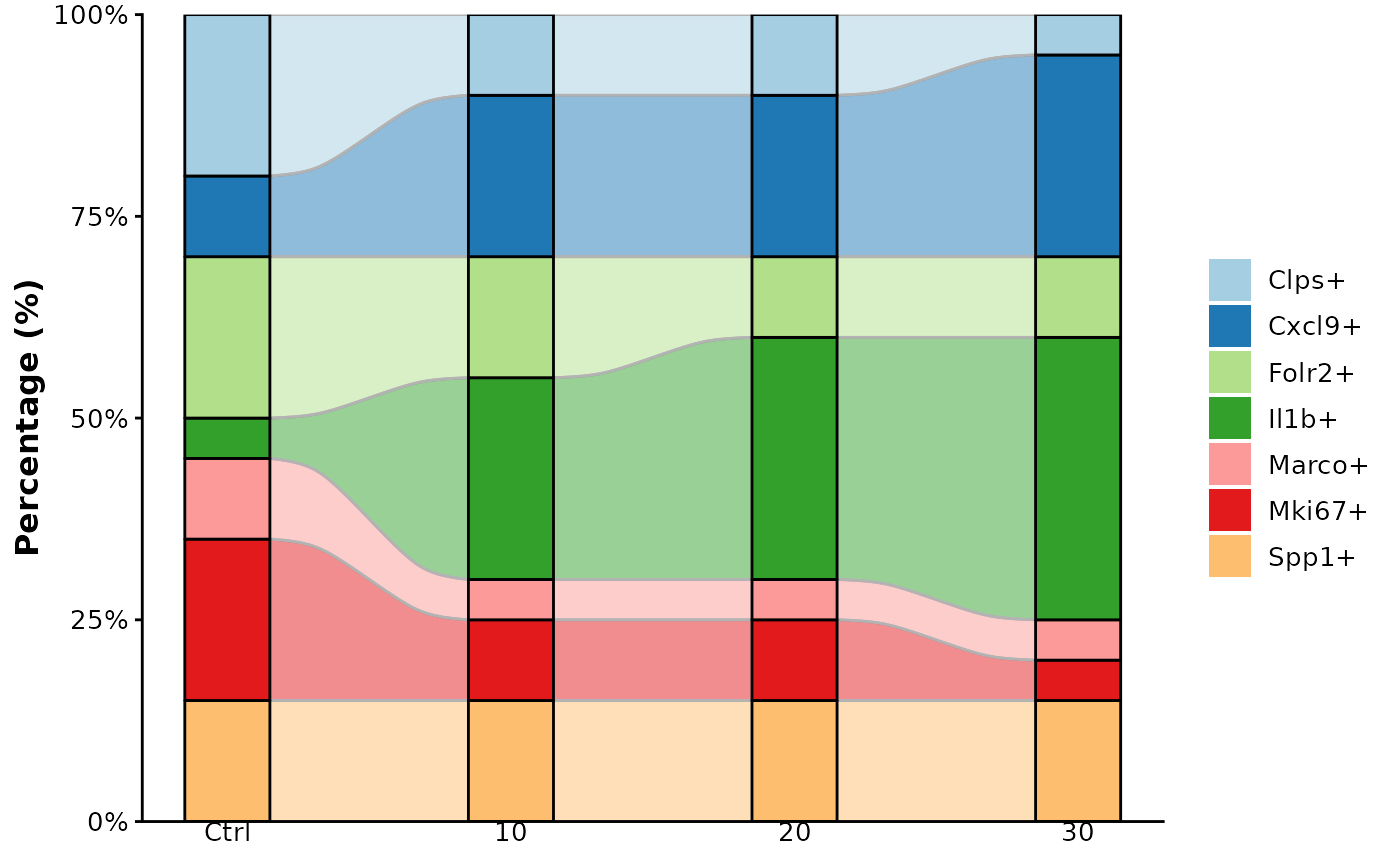 # custom palette (named vector)
named_cols <- c(
"Il1b+" = "#BDD7EE",
"Cxcl9+" = "#6FA8DC",
"Spp1+" = "#C6E0B4",
"Folr2+" = "#93C47D",
"Clps+" = "#F4B6C2",
"Mki67+" = "#E06666",
"Marco+" = "#F9CB9C")
plot_alluvial(example_data, palette = named_cols)
# custom palette (named vector)
named_cols <- c(
"Il1b+" = "#BDD7EE",
"Cxcl9+" = "#6FA8DC",
"Spp1+" = "#C6E0B4",
"Folr2+" = "#93C47D",
"Clps+" = "#F4B6C2",
"Mki67+" = "#E06666",
"Marco+" = "#F9CB9C")
plot_alluvial(example_data, palette = named_cols)